
Unlock the Hidden Power of CSS Units
Are you annoyed by websites that look great on your laptop but fall apart on your phone? You’re not alone!
The truth is surprising: 94% of first impressions depend on design. Your choice of CSS units can shape that key moment.
In this must-read guide, I’ll share the key tools that pro developers use. These tools help create stunning, reliable layouts that look great on any device.
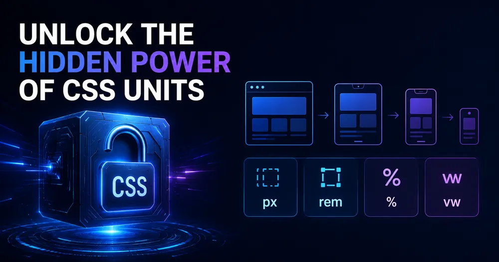
Why Smart Developers Are Abandoning Pixels for These Game-Changing CSS Units
Traditional pixel-based layouts are holding you back from creating truly flexible websites. Here’s why modern CSS units are your secret weapon:
- Instantly boost responsiveness across all devices without endless media queries
- Significantly enhance accessibility for users with vision impairments.
- Save hours of maintenance time with more efficient, adaptable code
- Guarantee consistency throughout your entire website
The Revolutionary Modern CSS Units You Need to Master Now
Relative Length Units That Will Transform Your Typography
rem – The Root EM Power Unit
The rem unit is your ultimate typography solution, providing perfect scaling relative to the root element:
html {
  font-size: 16px; /* Your base font size */
}

h1 {
  font-size: 2rem; /* Automatically scales to 32px */
}

p {
  font-size: 1rem; /* Always 16px regardless of nesting */
}Why rem units will change your life:
- Create perfect typography hierarchies
- Maintain consistent spacing throughout your site
- Allow users to zoom content without breaking layouts
em – The Secret to Component-Based Scaling
The em unit is your component scaling superpower:
/* html
<div class="parent">
    <div class="child">
        <div class="nested">...</div>
    </div>
</div>
*/


/* css */
.parent {
  font-size: 20px;
}

.child {
  font-size: 1.5em; /* 30px (1.5 × 20px) */
}

.nested {
  font-size: 1.5em; /* 45px (1.5 × 30px) */
}Best uses that will save you time:
- Create naturally scaling component hierarchies
- Build self-contained modules that adapt to their context
- Maintain proper proportions without manual calculations
Viewport Units: The Ultimate Responsive Design Secret
vw – Viewport Width: The Fluid Layout Superpower
.hero-text {
  font-size: 5vw; /* Automatically scales with viewport width */
}

.container {
  width: 80vw; /* Always 80% of viewport width */
}vh – Viewport Height: The Full-Screen Layout Solution
.full-screen {
  height: 100vh; /* Perfect full-screen sections every time */
}

.half-screen {
  height: 50vh; /* Always half of the screen height */
}vmin and vmax: The Adaptive Layout Game-Changers
.adaptive-element {
  font-size: 5vmin; /* Scales based on the smaller dimension */
  width: 70vmax; /* Uses the larger dimension for stability */
}Why viewport units will revolutionize your layouts:
- Create stunning full-screen experiences
- Build fluid typography that adapts perfectly to any device
- Maintain aspect ratios without JavaScript
Fractional Units (fr): The Grid Layout Breakthrough
.grid-container {
  display: grid;
  grid-template-columns: 1fr 2fr 1fr; /* Perfect ratio-based columns */
  gap: 20px;
}Why fr units will transform your grid layouts:
- Create perfectly proportional layouts without percentages
- Eliminate complex width calculations forever
- Build responsive designs with minimal code
Logical Units: The International Design Secret Weapon
CSS logical properties are a game changer. They help designs adapt to various writing systems and directions. They style content based on how it flows, not just where it sits. This makes them key for global websites.
Margin Logical Properties That Adapt to Any Language
.box {
  /* Automatically adjusts for RTL languages */
  margin-block-start: 10px;   /* Top in horizontal mode */
  margin-inline-end: 20px;    /* Right in LTR, left in RTL */
  margin-block-end: 10px;     /* Bottom in horizontal mode */
  margin-inline-start: 20px;  /* Left in LTR, right in RTL */
}Padding Logical Properties That Just Work
.box {
  /* Works perfectly in any writing mode */
  padding-block: 10px;      /* Top and bottom in horizontal mode */
  padding-inline: 20px;     /* Left and right, adapts to direction */
}Why logical units will save your international projects:
- Create layouts that automatically adapt to RTL languages
- Support vertical writing modes without code changes
- Build truly global websites with minimal effort
- Future-proof your code for any writing system
Proven Use Cases That Will Transform Your Design Process
Fluid Typography That Works Everywhere
h1 {
  /* Perfect scaling from small screens to large */
  font-size: clamp(1.5rem, 5vw + 1rem, 4rem);
}Container Queries: The Responsive Design Revolution
.card-container {
  container-type: inline-size;
}

@container (min-width: 400px) {
  .card {
    display: flex;
  }
}Balanced Layouts That Never Break
.layout {
  display: grid;
  grid-template-columns: repeat(auto-fit, minmax(250px, 1fr));
  gap: 1rem;
}Conclusion
Modern CSS units are the key to creating websites that look amazing on any device. Using units like rem, em, viewport measurements, and logical properties instead of pixels can save you time. You’ll also get better results.
Start with small changes in your next project:
- Use rem for typography and spacing
- Try viewport units for full-screen sections
- Implement fr units in your grid layouts
- Explore logical properties for international support
These simple changes will improve your designs. They will make them more responsive, accessible, and easier to manage. Your websites will look great on any screen size or language. You won’t need endless media queries or debugging.
Take the first step today. Your future self (and your users) will thank you!